Master paint color selection! Learn expert strategies to pick perfect wall colors, avoid undertone mistakes, and use peel-and-stick samples effectively.
Key Takeaways
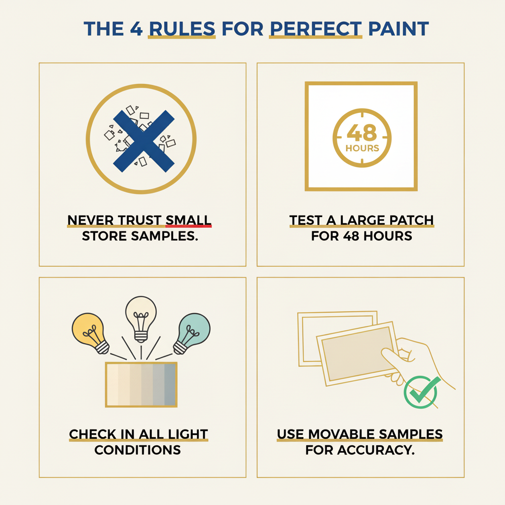
- **Forget Tiny Chips:** Never rely solely on small paint swatches; they're notoriously inaccurate.
- **Large Sample Testing is Key:** Always test paint on a significant patch of your actual wall for a minimum of 48 hours.
- **Beware of Undertones:** Neutral paints often hide sneaky undertones that can clash with your decor elements.
- **Lighting is Paramount:** Observe your samples throughout the day (morning, afternoon) and under artificial lighting at night.
- **Embrace Peel-and-Stick:** Our experts highly recommend movable peel-and-stick samples (e.g., Samplize) over traditional, messy sample pots for precision.
Key Takeaways
How to Pick Perfect Paint Colors: A BizzFactor Pro Guide
Expert Strategies for Choosing Wall Paint You'll Love
A client in Alpharetta just called me — third time this year. Repainted her dining room twice because the color "looked completely different" after the contractors left. She's not alone. I've been doing residential painting for two decades, and this same story plays out in probably 40% of the jobs we quote.
Here's our quick checklist (tape this to your fridge):
- **Forget Tiny Chips:** Never rely solely on small paint swatches; they're notoriously inaccurate.
- **Large Sample Testing is Key:** Always test paint on a significant patch of your actual wall for a minimum of 48 hours.
- **Beware of Undertones:** Neutral paints often hide sneaky undertones that can clash with your decor elements.
- **Lighting is Paramount:** Observe your samples throughout the day (morning, afternoon) and under artificial lighting at night.
- **Embrace Peel-and-Stick:** Our experts highly recommend movable peel-and-stick samples (e.g., Samplize) over traditional, messy sample pots for precision.
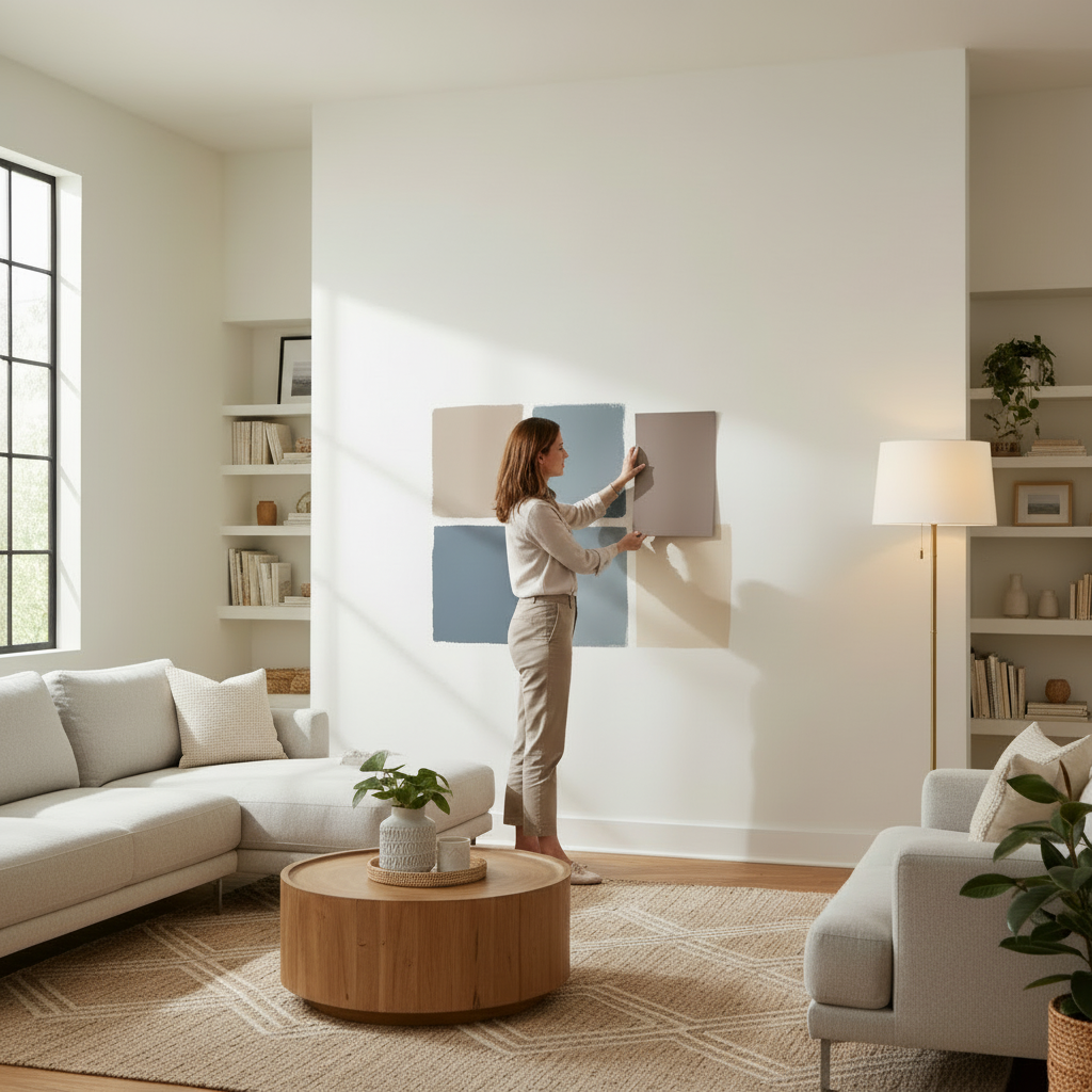
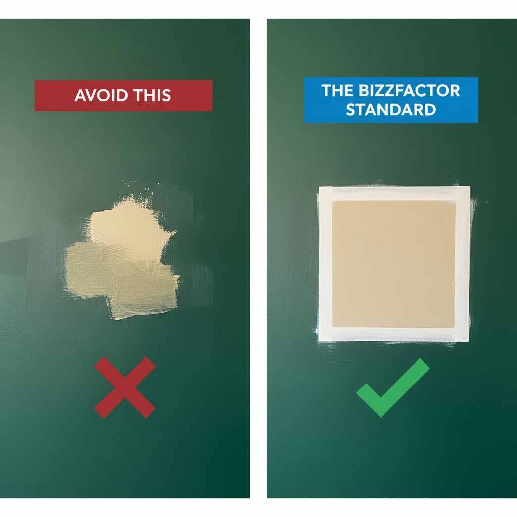
**The BizzFactor Standard:** Our team insists on painting a two-foot square test patch at minimum. This critical step is the only reliable way to prevent expensive repainting and frustrating color mismatches.
Your Guide to Picking a Paint Color You Won't Regret
There's no magic formula here. But you absolutely need to test big samples in your actual space — not the hardware store, not your friend's house, *your* space with *your* lighting. Variables? Oh, we've got variables. Hidden undertones. Your lightbulb choice (warm 2700K versus that harsh 5000K office lighting). Room size. Ceiling height. Whether you've got a window facing east or north.
Most people skip all this. They grab a chip, love it, buy three gallons, and then... regret.
Ever picked a seemingly perfect greige at the store, painted your entire room, only to find it suddenly looks purple or green? This "bleeding undertone" is a story our licensed house painters hear constantly. This guide will empower you to select paint colors with the confidence of a seasoned professional.
The #1 Paint Testing Mistake Homeowners Make
Look — i'll tell you what happens nine times out of ten: people paint their sample directly over the old wall color. Don't do this. The old color bleeds through — especially if you're going from a dark blue to a light gray — and completely warps what you're seeing. Your new "warm beige" might look peachy or pink because there's burgundy underneath fighting its way to the surface.
Prime a white square first. Two feet by two feet minimum. Then apply two coats of your sample paint inside that white box. Now you're seeing the real color, isolated, honest, no interference.
BizzFactor's Secret Weapon: Samplize vs. Traditional Sample Pots
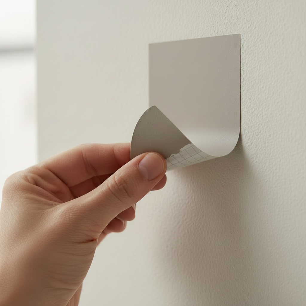
Look — I'm gonna save you some hassle. Stop buying those little $5 sample jars. Our painting contractors stopped recommending them years ago, and here's why: you're stuck. You paint one spot, you wait for it to dry, and if you want to test it somewhere else? Tough luck. You're repainting or buying another jar.
We've switched entirely to peel-and-stick samples from companies like Samplize.
These things are made with actual Benjamin Moore or Sherwin-Williams paint, but they're on a repositionable decal. You can stick it on the north wall, hate it, peel it off, try the south wall. Hold it next to your couch. Move it to the hallway. No mess, no brush cleanup, no patching nail holes afterward. A guy in Buckhead tested seven colors in one afternoon — try doing that with sample pots. It's a game-changer for accurate color selection (and yeah, I know I'm not supposed to say "game-changer," but in this case it actually is).
Why Paint Chips Lie: The Psychology and Science of Color Perception
Paint chips are tiny. And they're sitting under fluorescent lights at Home Depot. Your living room? Not tiny. Not fluorescent (I hope). The color you're seeing on that 2x2 inch square won't translate — it can't, really, because your home has completely different conditions. Room orientation matters. Natural light matters. Whether you're using matte or satin finish matters a lot.
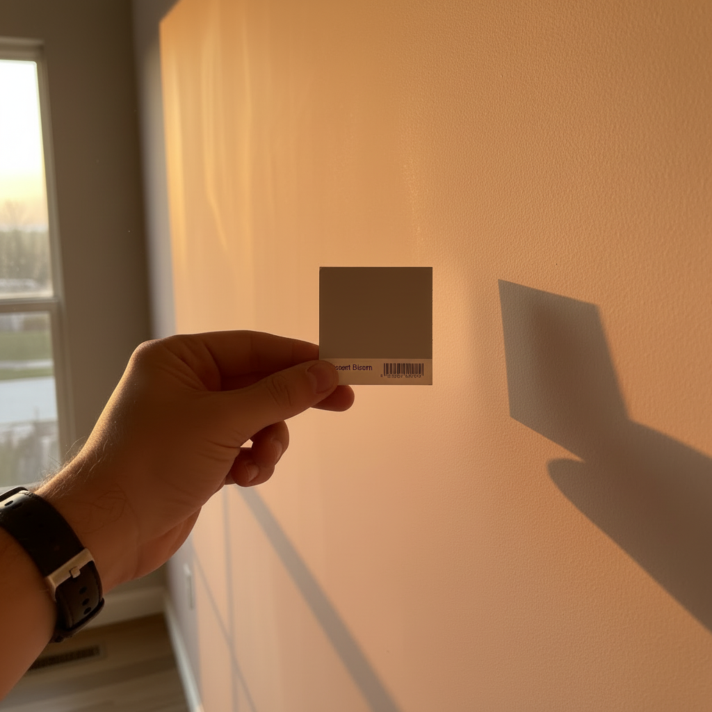
- **Metamerism: Light is Everything:** Color perception is highly dependent on the light source. This scientific principle, known as metamerism, explains why a color can look different under various lighting conditions. For example, the cool, bluish light from a north-facing room will render a paint color distinctly different from the warm, yellow light of a south-facing room. A small chip simply can't account for these dynamic shifts.
- **Scale Amplifies Color:** A soft gray on a chip? Looks gentle, sophisticated. That same gray on a 12-foot wall? Suddenly it's cold. Imposing. Maybe even depressing if you're not expecting it. Colors get bolder as they get bigger — always.
- **Sheen & Texture Influence:** Matte finishes absorb light, so colors look deeper and richer (sometimes darker than you planned). Eggshell or satin bounces light around, making the same color seem brighter and — honestly — easier to clean when your kid smears peanut butter on it.
Navigating the "Neutral Color Trap" and Identifying Sneaky Undertones
"Neutral" is marketing speak. What they mean is "we hid some weird undertones in here and you won't notice until it's on your wall." I've seen beiges turn pink. Grays turn lavender. Off-whites that straight-up look green in certain light. These aren't defects — they're just how paint works. Almost every greige or "warm white" is a cocktail of pigments, and under your specific lighting, one of those pigments is gonna dominate.
Take Benjamin Moore's "Revere Pewter" — massively popular, and it's got green-beige undertones. In some rooms? Gorgeous. In others? Looks like you painted with swamp water.
You can't see this on a paint chip.
The Pro Trick: How to Spot an Undertone
Here's what our seasoned painters do: flip the paint strip over (or look at the bottom of it). See that darkest, ugliest, most saturated color at the end? That's your undertone family. If that bottom color is a weird purple-brown, guess what — your "soft gray" has purple in it. If it's a mossy green, your "greige" is gonna lean green. Those base pigments sneak into every lighter shade on the strip.
Real-World Case Study: The 'Baby Blue' Gray Dilemma
Here's the thing: last spring we did a consultation in Dunwoody — couple was *furious* about their living room. They'd picked Sherwin-Williams "Repose Gray" after seeing it in a magazine. South-facing walls? Looked great. Warm, soft, exactly what they wanted.
The north-facing accent wall? Baby blue. Like a nursery.
**The Core Problem:** That north light is *cool* — it's got a blue cast to it naturally. And Repose Gray has subtle blue/purple undertones (see the trick above — check the bottom of the strip). Add in their oak floors, which were super orange-toned, and you've got complementary colors fighting each other. Blue undertone + orange floor = the blue looks *even bluer*.
**The BizzFactor Solution:** We didn't repaint the whole room (that would've been $1,800). We repainted just that one north wall with "Agreeable Gray," which leans beige instead of blue. Cost them $320. Problem solved. The room finally felt cohesive, and they stopped leaving us one-star Google reviews they were drafting in their heads.
The BizzFactor Pro's Playbook: A Foolproof Method for Color Selection
Our methodology is stupidly simple, but people skip it anyway: test big samples on your actual walls for 48 hours minimum. Watch them in morning light. Afternoon light. At night with your lamps on. If you skip this, you're gambling, and the house always wins.
Follow these expert-approved steps from our certified painting technicians:
1. **Strategic Inspiration Gathering:** Explore design inspiration on platforms like Houzz or Pinterest. Crucially, pay attention to the *entire room aesthetic*—consider flooring, furniture colors, and overall style. Seriously. Your chosen paint color must integrate seamlessly into a complete design system.
2. **Order Large, Movable Samples:** Spend $20-$30 on 3-4 peel-and-stick samples. This is insurance against a $1,500 repainting disaster. I've seen people drop $400 on a "statement light fixture" but refuse to spend $25 testing paint. Priorities, people.
3. **Place and Observe for 48 Hours:** Stick 'em up on the main walls. Check them when you wake up. Check them at lunch. Check them at 9 PM with your living room lights on (because you'll be looking at this color at 9 PM for the next five years). A color that looks perfect in daylight might turn dingy and sad under your LED bulbs.
4. **Test Against Existing Decor:** Hold the sample right up against your couch. Your curtains. Your rug. Does the gray suddenly make your beige sofa look pink? Does it clash with your trim? This is where you catch disasters before they happen, not after you've already bought three gallons.
For more insights into creating harmonious interiors, explore our guide on [interior design trends](/blog/interior-design-trends).
What Distinguishes a Truly Professional Paint Job?
Real talk — a pro paint job isn't about the painting. It's about the prep. Our licensed painters spend probably 60-70% of their time patching, sanding, and priming. If the surface isn't smooth and properly sealed, your $85-per-gallon Benjamin Moore Aura is gonna look like garbage. That's the real issue. The PCA (Painting Contractors Association) backs this up — prep is everything.
So what should you actually look for when you're hiring a painter?
When our inspectors evaluate a completed project, we insist that it conforms to **The BizzFactor Standard**. A genuine professional invests significantly more effort in preparation than in painting. Here's what you're truly investing in:
- **Impeccable Surface Preparation:** Every nail hole filled. Every crack repaired. Every surface sanded smooth. This isn't optional — it's the difference between a finish that looks good and one that looks *flawless*.
- **Strategic Primer Application:** There's no such thing as "universal primer" (don't let anyone tell you otherwise). Water stains? You need a stain-blocking primer like Kilz or BIN. Glossy old paint? Bonding primer. New drywall? Different primer. A real painter knows this stuff.
- **Razor-Sharp Cut-in Lines:** Where your wall meets the ceiling, where it meets the trim — those lines should be *crisp*. No wavy edges, no paint bleed, no "eh, close enough." This takes skill and patience, and it's the first thing you notice when it's done wrong.
- **A Consistent, Uniform Finish:** Zero roller marks. Zero drips. Zero streaks. The color should look identical from one corner to the opposite wall, and the sheen should be perfectly even. All painting work completed through BizzFactor is backed by a comprehensive satisfaction guarantee and warranty, a testament to our confidence in this meticulous process.
For further details on maintaining your home's exterior, refer to our [exterior painting tips](/blog/exterior-painting-tips).
In-Depth Look
Detailed illustration of key concepts
Visual Guide
Infographic illustration for this topic
Side-by-Side Comparison
Visual comparison of options and alternatives
Sources & References
- Paint Colors For Beginners: How To Choose Fast (With ... - YouTube
- A Step-by-Step Guide to Choosing House Painting Colour ... - Wakefit
- How to Choose Paint Colors for Your Home Interior Like a Pro
- How to Choose Paint Colors for Your Home - YouTube
- Best Interior & Exterior Paint Buying Guide - Consumer Reports
- Best Paint for Commercial Buildings - Miko LLC
- PCA Industry Standards - Made Possible by the PCA Education ...
- Best Industrial Painting Brands: A 2025 Comparison Guide
- Building Codes, Standards, and Regulations: Frequently Asked ...
Frequently Asked Questions
Need Professional Help?
Find top-rated house painters experts in your area