Transform small rooms with clever tile patterns! Discover 5 BizzFactor-approved designs that optically enlarge your space by up to 30%.
Key Takeaways
- **Run parallel to your longest wall.** That's your dominant visual line — you want to extend it, not fight it.
- **Skinny grout lines only.** I'm talking 1/8 inch max. Anything wider starts creating visual breaks that kill the whole effect.
- **Spacing matters more than you think.** Even 1/16 inch variation between tiles reads as sloppy from ten feet away.
- **Light it right.** Recessed lights running parallel to your tile direction? Chef's kiss. Highlights the flow instead of creating weird shadows.
- **Matte beats glossy.** Shiny tiles create hotspots and glare that distract from the linear pattern. Matte finishes let the eye glide.
Key Takeaways
5 Tile Patterns That Make Small Rooms Look 30% Bigger: A BizzFactor Guide
Ever walk into a 75-square-foot bathroom that feels more like a penalty box than a spa? I've installed tile in hundreds of cramped Atlanta homes where the previous flooring actually made rooms feel *smaller*.
Here's what most contractors won't tell you: you don't need to knock down walls or blow $40k on a renovation. The right tile pattern can trick your brain into seeing 30% more space that isn't actually there. I'm talking about strategic installations that cost a few thousand bucks but deliver results that look like structural changes.
Look — look — at BizzFactor, our certified installers have spent two decades perfecting these visual expansion tricks. This guide breaks down the five patterns we use most — the ones that actually work, not the Pinterest fantasies that look great in renders but fail in 8-foot-wide hallways.
1. Diagonal Tile Patterns: Breaking Visual Boundaries for Enhanced Space Perception
Want to know the fastest way to add visual square footage? Angle everything at 45 degrees.
I'm serious. When we install 12x24 rectangular tiles on the diagonal instead of straight, homeowners think we've somehow expanded their actual floor plan. We haven't. But their brain can't find the room's edges as easily anymore, so the whole space reads bigger.
I learned this back in 2009 from an old-timer in Buckhead who'd been laying tile since the '70s. He showed me a 5x8 powder room where straight tiles made it feel like a hallway, then the same room with diagonal Hyperion tiles — suddenly it had dimension. Multiple sight lines. Your eye travels across longer distances because you're following angled grout lines instead of hitting walls head-on.
Why Your Brain Falls for Diagonal Layouts
So why does this actually work for **small room flooring ideas**?
Your brain processes angled lines way different than straight ones. When tiles run perpendicular to walls, your eyes hit boundaries fast — boom, you've measured the room in two seconds. But diagonal? Multiple focal points. Your gaze has to travel further to "find" the walls. You're unconsciously following longer visual paths.
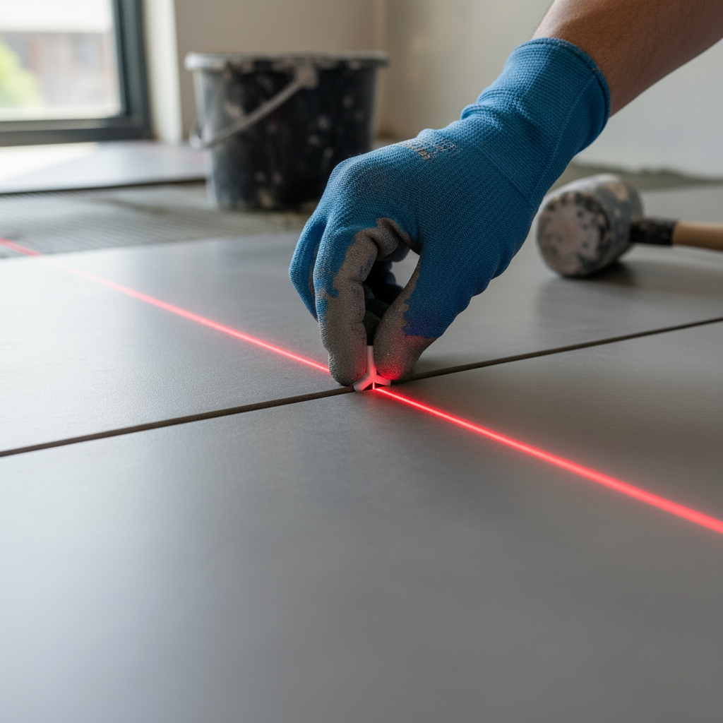
We follow The BizzFactor Standard on these installs, which means every diagonal cut gets measured twice and verified with digital tools. One degree off and the whole pattern looks drunk.
How We Actually Install Diagonal Tiles (Without Screwing It Up):
1. **Laser-Level Alignment:** Look, we bring out the big laser levels for these jobs. You need that kind of accuracy when you're shooting for perfect 45-degree angles — a bubble level from Home Depot won't cut it.
2. **Grout Line Consistency:** Keep those grout lines at 1/16 inch. That's it. Any wider and you lose the clean visual flow that makes this pattern work.
3. **Start From Center:** We always start dead-center in the room and work outward. Guarantees symmetry. Prevents that awkward thing where one side has full tiles and the other's all slivers.
4. **Hide the Ugly Cuts:** Border cuts go under the vanity, behind the toilet, along the back wall — anywhere eyes don't naturally land first.
5. **Digital Angle Checks:** Every third row, we're pulling out the digital protractor. Paranoid? Maybe. But I've seen what happens when angles drift even two degrees over ten feet.
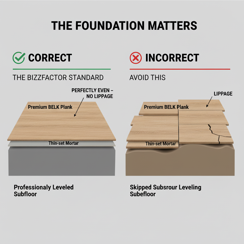
The Importance of Impeccable Subfloor Preparation for Lasting Results
Real talk — most contractors skip the foundation work because it's boring and cuts into their margins.
I recently inspected a $25,000 renovation in Sandy Springs where some handyman laid gorgeous large-format tiles over a subfloor that looked like a potato chip. Within six months? Cracked tiles everywhere. Lippage you could trip on. The whole "bigger room" illusion completely destroyed because the floor looked like a disaster zone.
This is why we partner with [A-1 Concrete Leveling](/services/concrete-leveling) before we lay a single tile. Their slab leveling system isn't just prep work — it's insurance against everything going sideways. Even premium BELK planks will look like garbage on an uneven base.
Pro Tip for Maximizing Impact in Tiny Spaces (Under 30 Square Feet)
Here's a weird trick for powder rooms under 30 square feet: sometimes you should stop *trying* to make them look bigger.
Controversial, I know. But in really tiny spaces, going full-contrast — like black grout on white hex tile — can make the room feel intentionally luxurious instead of apologetically small. Think jewel-box, not penalty-box. I stole this from high-end restaurant design, and it works surprisingly well for bold **tile colors for small rooms** when you commit to it.
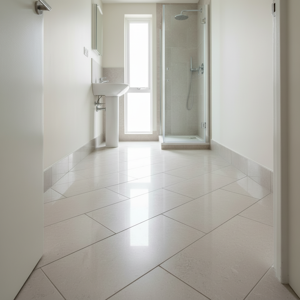
2. Elongated Rectangular Tiles: Stretching Space with Horizontal Flow
You know those plank tiles that look like hardwood? They're basically magic tricks for small rooms.
Here's what happens: you lay them lengthwise across a space and suddenly people swear the room got bigger. It didn't. But your eye follows these long horizontal lines instead of bouncing off walls every two seconds, so your brain *thinks* there's more square footage. We're talking a perceived 20-30% size increase just from changing the visual flow.
BELK Tile's 6x36 planks are stupid-effective for this. Last spring we did a 10x12 bedroom in Decatur, and when we finished, the homeowner kept insisting we'd somehow made the room physically longer. We hadn't. But the continuous lines made her brain think we had — that's the power of thoughtful **tile design**.
The Psychology of Leading Lines and Grout Selection
This works because of leading lines, which is fancy design-speak for "your eye follows horizontal paths automatically."
Here's the thing: but here's where most DIYers screw it up: they pick contrasting grout. Dark grout on light tile creates a grid that emphasizes every single line break. That's the real issue. You want grout that *disappears* — matching colors that create seamless transitions. [Apollo Tile's matching grout systems](https://www.apollotile.com/grout) are clutch for this because their color consistency is verified across batches.
Our Go-To Moves for Installing Elongated Tiles:
- **Run parallel to your longest wall.** That's your dominant visual line — you want to extend it, not fight it.
- **Skinny grout lines only.** I'm talking 1/8 inch max. Anything wider starts creating visual breaks that kill the whole effect.
- **Spacing matters more than you think.** Even 1/16 inch variation between tiles reads as sloppy from ten feet away.
- **Light it right.** Recessed lights running parallel to your tile direction? Chef's kiss. Highlights the flow instead of creating weird shadows.
- **Matte beats glossy.** Shiny tiles create hotspots and glare that distract from the linear pattern. Matte finishes let the eye glide.
Real Case Study: Transforming a 75-Square-Foot Bathroom with Elongated Tiles
One of my favorite transformations was a master bath in Virginia-Highland. The homeowner had dropped $15,000 on fixtures — rainfall showerhead, heated floors, the works — but still felt claustrophobic every morning.
The culprit? Busy 4x4 tiles in a basic grid. Hundreds of grout lines creating visual clutter that made your eyes work overtime just scanning the floor.
We ripped it out and installed 12x24 BELK porcelain planks in a running bond pattern, parallel to the 8-foot vanity wall. Same 75 square feet. But she swore it felt 25% bigger. The difference was eliminating all those visual interruptions and establishing continuous horizontal flow — core principle of effective **small room flooring**.
3. Herringbone and Chevron Patterns: Dynamic Movement for Perceptual Expansion
So herringbone and chevron are basically visual sleight-of-hand.
Instead of letting your eye settle on where the walls are (and how close together they sit), these patterns create this rhythmic movement that pulls your gaze through the room. You're following the zigzag flow instead of measuring boundaries. Works brilliantly as **floor patterns for small rooms** when you want that high-end look with actual spatial benefits.
Understanding the Distinction: Herringbone vs. Chevron for Space Enhancement
Quick clarification because contractors mix these up constantly:
Herringbone uses rectangular tiles meeting at 90-degree angles in a staggered zigzag. Chevron requires precise mitered cuts to form continuous zigzag lines with pointed ends. If a contractor tells you they're "basically the same," run. Improper installation kills the **visual room expansion** effect completely.
Our certified technicians install both regularly, usually with [Apollo Tile's precision-cut natural stone collection](https://www.apollotile.com/natural-stone). Their factory-finished edges save hours of field cutting and deliver warrantied results.
Why Substrate Prep Is Make-or-Break for These Patterns
Here's the thing nobody mentions in those Instagram reels: intricate patterns are unforgiving.
Now, they magnify every single floor irregularity. Even a 1/4-inch dip becomes glaringly obvious because the pattern draws your eye right to it. This is why proper [substrate preparation by companies like A-1 Concrete Leveling](/services/concrete-leveling) isn't optional — it's absolutely essential for both aesthetics and safety with **herringbone tile for small rooms** or chevron.
I've seen $8,000 installations ruined because someone skipped the $400 leveling step.
What These Patterns Actually Require:
1. **Dead-level substrate.** We're talking 1/8 inch variance max over ten feet. Any more and you'll see lippage between tiles that ruins the whole visual effect.
2. **Right trowel size.** Herringbone needs more adhesive coverage than straight patterns — wrong trowel and you get hollow spots that crack under foot traffic.
3. **Obsessive grout spacing.** Even 1/32 inch difference between lines shows up glaringly in these geometric patterns.
4. **Center-out layout.** Start from the middle of the room and work toward walls. Only way to guarantee symmetry.
5. **Constant angle verification.** I've got guys who check angles every single row because one degree off compounds into a disaster by the time you hit the far wall.
**Quick Answer:** For smaller spaces, herringbone usually works better because it's more forgiving during installation. You get superb **space-enhancing tile ideas** without the stress of perfect mitered cuts that chevron demands.
4. Large Format Tiles: Minimizing Visual Interruptions for Expansive Views
Large format tiles crush space perception by reducing grout line density around 80%. Fewer visual interruptions mean cleaner sight lines. Your eye flows smoothly instead of getting caught on hundreds of grid intersections — staple move in modern **small room flooring ideas**.
Contemporary 24x48 slabs from Hyperion can transform even cramped 50-square-foot spaces into sophisticated, open-feeling environments. I've watched these genuinely shock homeowners with their **visual room expansion** capabilities when installed correctly.
Why Fewer Grout Lines = More Openness
Think about it like this: every grout line is a visual speed bump. Your eye has to process it, which creates mental "clutter" even if you don't consciously notice.
Traditional 12x12 tiles in a 10x10 room? You're looking at maybe 80+ grout intersections. Large 24x48 slabs? Maybe 12 total lines. Your gaze flows like water across the surface instead of hopscotching across a grid. That's the key to successful **small space design with tiles**.
Now, but (and this is a big but) — installing large format tiles requires specialized techniques. Any substrate deviation shows up immediately. We're talking 1/32-inch tolerances here. This isn't weekend warrior territory.
What We Demand on Large Format Jobs:
- **Lippage under 1/32 inch.** Period. These big tiles show even tiny height differences between adjacent pieces.
- **Grout lines between 1/16 and 1/8 inch.** Consistent. Not "close enough" — actually measured.
- **Laser levels on everything.** The bigger the tile, the less room for error. Bubble levels don't cut it.
- **Expansion joints per manufacturer specs.** Skip these and you're basically waiting for the cracking to start.
- **Background-checked installers only.** You're letting someone into your home with expensive materials — we make sure they're trustworthy pros.
**Common Question:** Can large
In-Depth Look
Detailed illustration of key concepts
Visual Guide
Infographic illustration for this topic

Side-by-Side Comparison
Visual comparison of options and alternatives
Sources & References
- The Art of Tile: How to Design a Space That Truly Reflects You
- What is Tile Layout? Guide to Floor & Wall Patterns 2025
- Step-by-Step Guide to Tile Patterns for Modern Spaces - BELK Tile
- Tile Shapes: A Complete Guide to Beautiful Design
- Tile Layout Tips - YouTube
- Building Codes, Standards, and Regulations: Frequently Asked ...
- Building Codes and Standards - 101 Guide | ROCKWOOL Blog
- [PDF] Building Codes Toolkit for Homeowners and Occupants - FEMA
- Building Codes - Air Conditioning Contractors of America - ACCA
- 5 Reasons Building Codes Should Matter to You
Frequently Asked Questions
Need Professional Help?
Find top-rated flooring & tile experts in your area