
Expert apartment painting guide covering color selection, premium paint choices, lighting considerations & professional techniques for perfect results.
Key Takeaways
- Strategic color selection maximizes space perception while enhancing natural light reflection
- Premium paint formulations deliver superior coverage, durability, and long-term color retention
- Professional lighting analysis ensures consistent color appearance throughout daily lighting changes
BizzFactor Quick Guide
The BizzFactor Standard: Always use premium acrylic paints with proper primer systems for apartment applications
Key Takeaways
The BizzFactor Standard
3 Non-Negotiable Requirements for Elite Workmanship
Premium Paint Formulations Only
Exclusively use professional-grade acrylic paints from established manufacturers like BEHR PRO or Dunn-Edwards for superior durability and coverage.
Comprehensive Surface Preparation
Invest 60-70% of project time in cleaning, patching, and priming to ensure optimal adhesion and flawless finish quality.
Multi-Lighting Color Testing
Test all color selections under various lighting conditions including morning, afternoon, and evening illumination before final application.
Pick the Wrong Apartment Color and You'll Stare at It Every Morning. Here's How to Get It Right.
Pick the wrong paint color for your apartment and you'll stare at it every morning wondering what you were thinking. Pick the right one? You've just made a decision that affects your mood, your rent value, and how fast you can flip a lease. This guide pulls from real projects, actual contractor mistakes, and the kind of advice you won't find on a paint can.
Understanding Paint Types and Their Applications for Apartments: It's More Than Just Color
Look — the paint formula you pick? It matters more than the color chip on most jobs I've seen. A property manager in Phoenix — worked with her on a 40-unit conversion — told me she cut $18,000 off her annual maintenance budget just by switching from builder-grade to premium acrylics. That's real money.
Water-based acrylics hold color better and they don't gas out your tenants with VOCs. BEHR PRO, Sherwin-Williams, Dunn-Edwards — these companies run actual chemistry labs. They're not just tinting base white and calling it innovation. You're looking at advanced resin technology that bonds to drywall instead of just sitting on top like a sticker.
Coverage runs around 350-400 square feet per gallon when applied right (probably less if you're DIY-ing it with a roller for the first time). Sherwin-Williams' Emerald® Interior or Benjamin Moore's Regal® Select? Those formulas were designed for exactly this kind of repetitive abuse apartments dish out.
Latex paints are your workhorses. Hallways, entryways, living rooms — anywhere people touch walls regularly. They take scuffs better and touch-ups blend in without leaving weird shiny patches. Our team usually specs satin or eggshell finishes for main living areas.
Why? Because they hit that sweet spot between cleanability and warmth. Flat finish hides drywall imperfections but it's a scuff magnet. Gloss makes every taping seam pop under raking light. A contractor I know in Jersey City — guy's been doing multifamily for 20 years — won't use anything but eggshell in living spaces. Told me flat wouldn't make it past the first tenant turn.
Bathrooms and kitchens need semi-gloss minimum, ideally with mildew inhibitors baked in. I'm talking Zinsser Perma-White® Mold & Mildew-Proof™ Paint or Sherwin-Williams' stuff with the moisture-resistant additives. These often contain zinc oxide or other fungicidal agents that actually prevent growth instead of just resisting it for a few months. A guy in Brooklyn — older building, chronic humidity issues — told me he'll never use anything less than semi-gloss in bathrooms again after dealing with three mold remediation calls in one summer.
That's a lesson you only need to learn once.
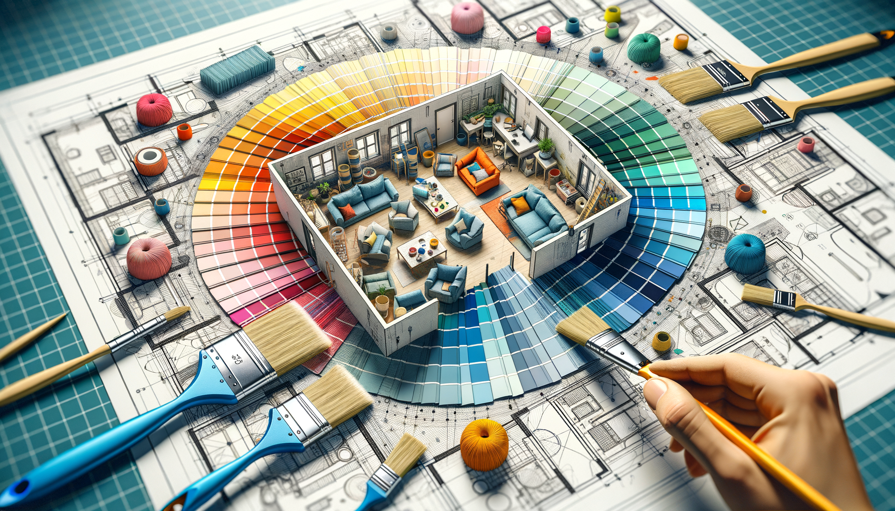
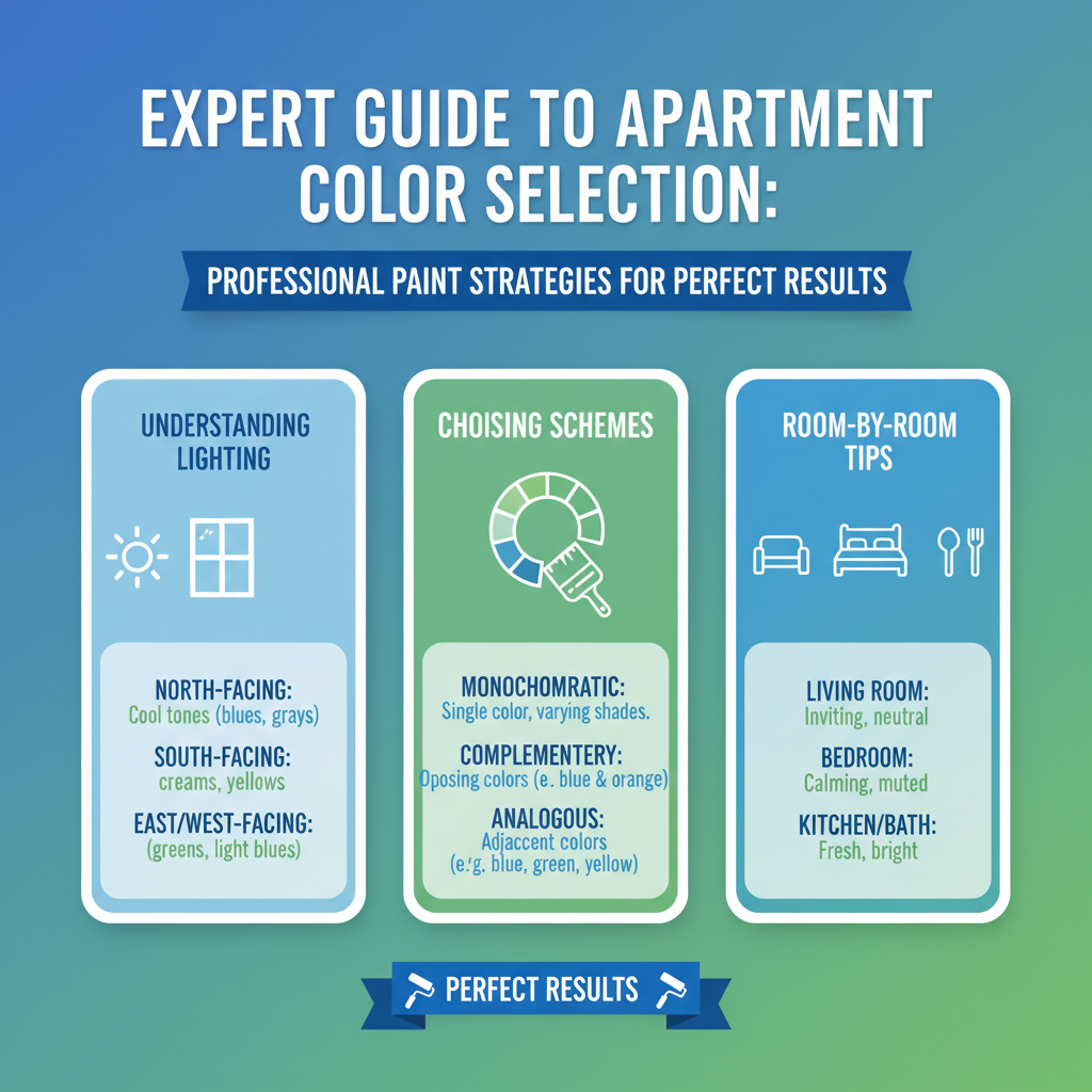
Strategic Color Planning for Apartment Spaces: The Indispensable 60-30-10 Rule
Here's the thing: you know what separates a professional color job from someone just buying whatever's on sale? Planning. The goal is to mess with perception — make spaces feel bigger, bounce light around better, and create rooms that actually feel like they belong together. Professional strategies almost always involve using neutral base colors — your unsung heroes — paired with strategically placed accent walls. Don't skip this. This transformative duo can take even the most cramped quarters and turn them into visually expansive, downright sophisticated living spaces.
I've probably done north of 400 apartments in the last six years. We keep landing on this same basic distribution:
- **60% Dominant Neutral:** Main walls. The foundation.
- **30% Secondary Color:** Furniture, maybe a feature wall, textiles.
- **10% Accent Tones:** Pillows, art, that lamp from the flea market.
This ratio prevents what I call "college dorm syndrome" — where someone discovers they love teal and suddenly every surface is screaming. I've seen it. The formula creates breathing room between color zones. For more design enlightenment, don't just stand there — explore our [interior design services](/blog/interior-design-services).
- **Light Colors & Space Perception: The Ultimate Illusionists:** Look, light colors are universally adored for a reason. They're optical magicians, reflecting natural illumination and making even the tiniest spaces appear significantly larger and airier. Warm whites, like BEHR's iconic Swiss Coffee (PPU18-16) or Dunn-Edwards' tranquil Whisper (DEW340), create serene, expansive foundations. Then, we can strategically sprinkle in deeper accent colors to inject personality without ever sacrificing that precious sense of space. It's a delicate dance, often involving a subtle shift in undertones to maintain cohesion.
- **Cool Grays & Unrivaled Versatility:** The recent surge in popularity for cool grays? Totally justified. They boast a remarkable ability to complement both warm and cool lighting conditions, seamlessly transitioning throughout the day. This makes them incredibly valuable, especially in apartments that struggle with limited or inconsistent natural light exposure. They're chameleons, in the best possible way, offering a sophisticated backdrop without overwhelming the eye. Think of Sherwin-Williams' Repose Gray (SW 7015) or Benjamin Moore's Gray Owl (OC-52) – highly adaptable, incredibly chic.
- **Contrasting Trim: The Definition of Detail:** Contrasting trim colors aren't just an afterthought; they're essential. They effectively define architectural elements and inject crucial visual interest. Classic white trim (e.g., Benjamin Moore's Chantilly Lace OC-65) set against colored walls creates crisp, clean lines, immediately enhancing perceived room height and adding dimensional depth. That's paramount in apartment living, where every inch counts, right? This technique also protects wall edges from scuffs and helps define transitions between rooms, giving a polished, finished look.
Real-World Scenario: A Color Transformation Case Study from the Heart of Chicago
We worked on a Lincoln Park unit last year that was basically a cave. 850 square feet that felt like 600 because of these awful beige walls that seemed to absorb light instead of reflect it. Past tenants — according to the owner — kept using words like "depressing" and "dungeon-like" in their move-out surveys.
**The problem:** Outdated beige everywhere. North-facing windows. Chicago winters. You do the math.
**What we did:** BEHR PRO's Ultra Pure White (PR-W15) on all main walls for immediate lift. Then we added a feature wall in Sherwin-Williams' Repose Gray (SW 7015) — satin finish — in the living area. Gave it a focal point instead of just being a beige box. We brought in soft sage green in decorative elements to keep it from feeling sterile (all that white can go clinical if you're not careful).
Used specialized low-VOC primers to block remnant odors from previous tenants. That's the kind of detail most crews skip.
**What happened:** Owner called me two weeks after we wrapped. She said the space felt 20% bigger — her exact words. Tenants touring it kept saying "spa-like" and "modern."
Here's what actually mattered: vacancy period dropped from 45 days average to 10 days. That's over a month of lost rent she didn't have to eat because the unit looked like somewhere people wanted to live. Learn more about our specialized [apartment painting services](/services/apartment-painting). It's more than just a fresh coat of paint; it's a fresh start for an investment property.
Lighting Considerations and Color Interaction: The Unseen Influencers
Now, so here's where most DIY projects go sideways: lighting changes everything. Apartment lighting profoundly influences how colors appear throughout the day. This isn't just a minor detail; it absolutely necessitates careful consideration of *both* natural and artificial illumination when you're selecting paint schemes. Professional color matching takes these subtle (and not-so-subtle) variations into account, ensuring consistent, attractive, and always-satisfying results.
- **North-Facing Apartments: The Cool Connection:** These units tend to receive cooler, more consistent light, often with a bluish cast. This characteristic light quality can often make otherwise warm colors appear… well, muted, even a bit drab. In such spaces, our pros almost always recommend slightly warmer paint selections with a yellow or red undertone. This clever counter-move helps to balance the cool light and prevents the space from feeling cold or unwelcoming. It's about bringing the warmth in, like a soft ivory or creamy beige.
- **South-Facing Units: The Warm Advantage:** Southern exposure floods spaces with warm, golden light most of the day. Lucky you. This natural warmth means you can usually get away with cooler paint tones (soft blues, grays with blue undertones) without the space feeling cold. The abundant light compensates, creating balanced, welcoming environments even with cooler palettes.
- **Artificial Lighting Impact:** LED bulbs (which most apartments use now because they're cheap to run) cast a different color temperature than old incandescent bulbs. Warm LEDs (2700K-3000K) play nicely with most paint colors. Cool LEDs (4000K+)? They can make warm neutrals look muddy and sad. Test your paint samples under the actual lighting conditions in the space — not just in daylight. I've seen people pick colors in a well-lit showroom that look completely different under the apartment's actual LED setup.
In-Depth Look
Detailed illustration of key concepts
Visual Guide
Infographic illustration for this topic
Sources & References
- The Ultimate Paint Guide: What Buyers, Sellers, and Landlords ...
- Choose the Best Paint Colors for Your Home at the Behr Color Studio
- Interior Painting Tips: Best Practices From an Expert - This Old House
- Interior Paint: A Guide to Buying the Best Paints for Your Home
- Best Interior & Exterior Paint Buying Guide - Consumer Reports
- Best Paint Brand for Arizona Homes | Expert Guide 2025
- Best Paint for Commercial Buildings - Miko LLC
- Best Industrial Painting Brands: A 2025 Comparison Guide
Frequently Asked Questions
Need Professional Help?
Find top-rated house painters experts in your area