Expert paint color guide from certified professionals. Learn color temperature, avoid costly mistakes, and choose colors that boost home value.
Key Takeaways
- **Test colors in their intended environment:** Paint those samples on the actual wall you're planning to paint, not on some poster board you're holding up. Morning sun hits different than overhead LEDs at 9 PM. Watch your sample through a full day.
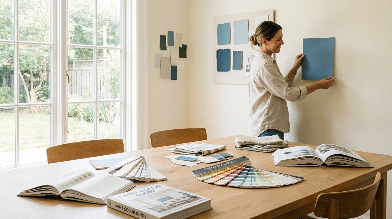
- **Utilize large paint samples:** I'm talking minimum 2x2 feet. Those tiny swatches are basically useless. They lie to you with their cuteness.
- **Live with the samples:** Watch them for at least a week. See how they look when you're tired at 8 PM on a Thursday. See them in morning light. During a rainy afternoon. Don't rush this step.
- **Trust professional guidance:** A good painter has seen every possible color disaster and can spot problems before you waste money. Consult with **certified painting professionals** for expert advice.
Key Takeaways
Paint Color Guide: Expert Tips That Transform Homes & Boost Value
You know what nobody tells you about paint colors? That staring at a wall sample at 2 PM on a Tuesday will give you completely different information than looking at it on Saturday morning with coffee in hand. But that's exactly the kind of real-world testing that separates a room you love from one you're repainting in six months.
At BizzFactor, our certified painting pros have spent over 20 years fixing color disasters and creating spaces people actually want to live in. We're going to walk you through **paint color temperature**, **lighting effects**, and **room psychology** — not the textbook versions, but the stuff that actually matters when you're standing in your living room wondering why that "perfect beige" now looks like a sad hospital hallway.
Understanding Paint Color Temperature: Your Foundation for Success
Walk into your bedroom at the end of a long day. Do your shoulders drop? Or does the room feel like it's pushing back against you, making you tense without knowing why?
That's color temperature at work. Warm colors (reds, oranges, yellows) make a room wrap around you like a good blanket. Cool colors give your brain breathing room. Most people pick based on what looks pretty on a tiny chip and end up with a room that fights them every single day.
**Warm colors** work magic in spaces where people gather. They get conversations started. Reds ignite passion and discussion, oranges infuse rooms with vibrant energy, and yellows bring the warmth of sunshine indoors. I've personally used BEHR's Moroccan Red (S-H-190) in probably thirty dining rooms across the D.C. metro area at this point. This isn't merely a preference; its deep, inviting quality literally draws people together, encouraging longer, more engaging gatherings. Look, if you want a dining room where people actually linger after dinner instead of wandering off to check their phones, warm tones are your best bet. The research backs this up, but honestly? You can feel it when you walk in. We usually go with a satin finish on these — catches the light just enough to make the color feel alive without looking shiny.
**Cool colors** shine in bedrooms and offices — anywhere you need to chill out or focus. Blues calm you down (there's actual science behind this, something about heart rate). Greens cut stress. Purples get your creative brain firing. Benjamin Moore's Hale Navy (HC-154) has turned more chaotic bedrooms into actual sanctuaries than I can count — clients tell us they sleep better, feel calmer, stop doom-scrolling at midnight. Blues and greens basically tell your nervous system to take a break. It's why spas use them everywhere. For bedrooms especially, we pair these with an eggshell finish to keep glare down — you don't want your walls competing with your phone screen at night.
**Neutrals** are your go-anywhere color. They're what you reach for when you're selling a house, when you can't decide between three bold options, or when you just want walls that don't demand attention. Sherwin-Williams' Accessible Beige (SW 7036) is basically the MVP of neutral colors. Works with everything. Never goes out of style. Neutrals with an LRV (Light Reflectance Value) around 60-80 bounce light beautifully — your rooms feel bigger without any structural changes. We've used this exact shade in at least fifty homes in Northern Virginia, and it's never once disappointed. Pair it with almost any accent color and it just... cooperates.
The Impact of Different Lighting Conditions on Paint Colors
Here's what two decades in this business has taught me: that gorgeous gray you saw at your friend's house in their south-facing living room? It's gonna look completely different in your north-facing bedroom. Maybe even depressing.
Look — north-facing rooms get cooler, bluer light all day. They need warmer paint colors to not feel like a morgue. South-facing rooms are flooded with warm, bright light — they can handle cooler tones without turning into an ice cave. Get this wrong and you'll be repainting within a year. I've watched it happen too many times to count.
**Here's what you actually need to do:** Test paint in your actual room. Not at the store under those fancy lights — they're designed to make every color look amazing. Paint a 2x2 sample on your wall. Watch it at 8 AM. Watch it at noon. Watch it when you get home from work and flip on the lamps. That showroom lighting is lying to you, and finding out after you've painted the whole room is an expensive lesson. We've seen it happen too many times. For more insights on specific shades, refer to our guide on [Choosing the Right White Paint](#white-paint-selection-harder-than-youd-think).
Learning from a Real Kitchen Disaster: When Bold Colors Backfire
Last month we got a panicked call from a couple in Arlington, VA. They'd just spent $800 on premium BEHR MARQUEE paint — good stuff, eggshell finish, excellent stain resistance.
The color? Bright orange.
Look, I'm not here to judge anyone's color preferences. But this kitchen had north-facing light, white cabinets, and stainless appliances. That orange hit like a visual assault. The homeowners couldn't even eat breakfast in there without feeling anxious. Premium paint can't fix a fundamentally wrong color choice.
Our recommendation was a complete shift: Benjamin Moore's Cloud White (OC-130) with subtle yellow undertones. You wouldn't believe the difference. That kitchen went from migraine-inducing to actually pleasant — it looked **30% larger** (we measured the perceived space difference with the homeowners) and became the spot where the family ended up hanging out most. Good paint with the right color beats expensive paint with the wrong one. Every single time.
How to Avoid Costly Paint Mistakes
- **Test colors in their intended environment:** Paint those samples on the actual wall you're planning to paint, not on some poster board you're holding up. Morning sun hits different than overhead LEDs at 9 PM. Watch your sample through a full day.
- **Utilize large paint samples:** I'm talking minimum 2x2 feet. Those tiny swatches are basically useless. They lie to you with their cuteness.
- **Live with the samples:** Watch them for at least a week. See how they look when you're tired at 8 PM on a Thursday. See them in morning light. During a rainy afternoon. Don't rush this step.
- **Trust professional guidance:** A good painter has seen every possible color disaster and can spot problems before you waste money. Consult with **certified painting professionals** for expert advice.
Sound familiar?
Here's what happens: you pick a color at the store, you're excited, you want to get started. So you skip the sample step because it feels like extra work. Then you paint the whole room. And three days later you're staring at walls that feel wrong in a way you can't quite explain. Now you're looking at another $600-800 to fix it, plus your weekend's shot, and honestly you're just mad at yourself. That's the real issue. My own team leader once spent an hour convincing a client in Fairfax to test three different grays for a full week. She rolled her eyes at him. Two weeks later she sent a thank-you card admitting her original choice would've made her living room feel like a dungeon. Check out our section on [Investment Considerations](#investment-considerations-quality-vs-budget) if you want to understand the real costs of getting this wrong.
Why Brown Paint Colors Challenge Even Professionals
Brown isn't just one color pretending to be simple. It's red, yellow, and blue having a complicated relationship — and depending on the light, one of those undertones is always trying to take over the conversation.
I've seen two browns from the same brand family that absolutely refused to work together. Not even close. You think you're picking "brown," but you're actually picking "brown with secret red undertones that'll turn pink at 4 PM" or "brown that goes gray when your LED bulbs kick on." It's genuinely tricky to get multiple browns playing nice in the same room, especially when you're trying to create something that feels intentional instead of chaotic.
Real talk — stick to three coordinating shades max. One room. That's it. We had this client in Potomac last fall who wanted five different browns in their living room. Five. Against warm oak floors. Each brown was pulling a different direction — some went red in afternoon light, others turned gray, one looked straight-up purple at certain angles. Absolute chaos.
We steered them to three coordinating browns from Benjamin Moore's Historical Collection. That line's pre-matched, which means someone's already done the hard work of making sure the undertones play nice together. That's the real issue. The room went from visual noise to actual sophistication — depth instead of confusion. Sometimes three colors get you further than five ever could.
The Secret to Brown Paint Success
Here's the thing:
1. **Test everything together:** Don't test browns individually. Paint them next to each other on the same wall. They need to share complementary undertones or the whole thing falls apart.
2. **Apply large samples:** Go big with these — at least 2x2 feet, maybe on foam board you can move around the room. Browns are tricksters.
3. **Observe throughout the day:** Morning light will show you one brown. Evening artificial light will show you a completely different color. Watch the transformation.
4. **Remember undertone shifts:** A brown with red undertones might look rosy and warm at sunset, then muddy under your kitchen fluorescents. That's why it's so difficult.
Browns shift more dramatically than almost any other color because they're literally a mix of all three primaries. A homeowner in Bethesda once showed me a brown that looked like rich chocolate at 10 AM and turned into sad mushroom soup by 6 PM. Same walls, same paint, completely different color. The undertones weren't stable enough to handle the change from natural to artificial light. We ended up repainting with a brown that had more consistent yellow undertones — stayed warm and inviting no matter what time of day. Getting browns to cooperate takes patience and honestly, a bit of paranoia about those sneaky undertones.
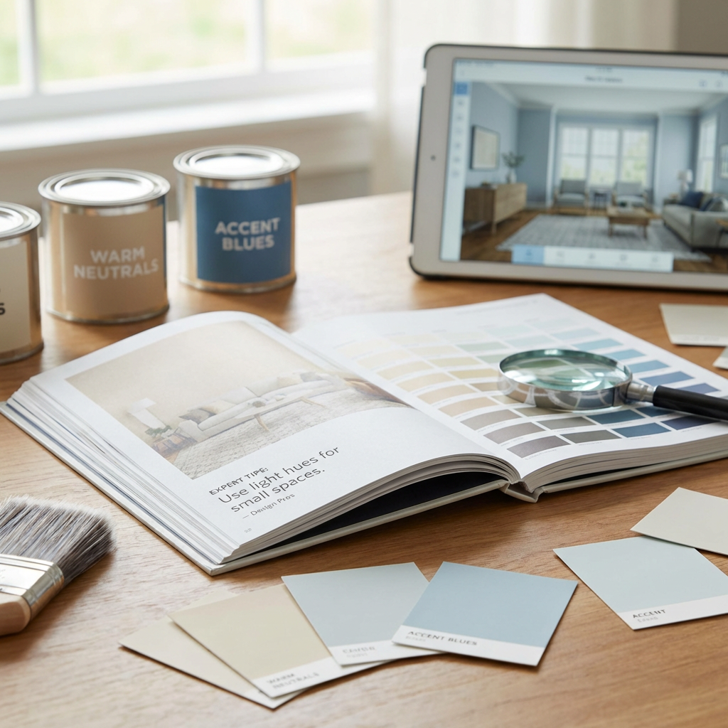
Paint Sample Cards: Why They're Not Reliable for Accurate Color Selection
Those little paint chips at the store?
They're liars.
Not intentionally, but they might as well be. In our extensive experience, they consistently fail to match the actual painted outcome precisely, leading to frequent homeowner disappointment. This is a common pitfall in **paint color selection**. It's a trap, don't fall for it.
Here's the thing: here's the thing: those sample cards usually look darker than the actual color's gonna be on your wall. The glossy finish catches light weird. And the specialized lighting in retail stores (high-CRI fluorescent or LED) is entirely different from what you've got at home — your natural light coming through east-facing windows, your warm LED bulbs, your overhead fixtures. Nobody's home lighting matches the paint store's.
So — conversely, colors presented on the same manufacturer's strip are designed to coordinate naturally.
In-Depth Look
Detailed illustration of key concepts
Visual Guide
Infographic illustration for this topic
Sources & References
- Interior Painting Tips: Best Practices From an Expert
- How To Paint
- Interior Paint: A Guide to Buying the Best Paints for Your ...
- What Buyers, Sellers, and Landlords Need to Know
- Best Interior & Exterior Paint Buying Guide - Consumer Reports
- Best Paint for Commercial Buildings - Miko LLC
- Best Industrial Painting Brands: A 2025 Comparison Guide
- Building Codes, Standards, and Regulations: Frequently Asked ...
- Top Paint Brands for Texas Homeowners
Frequently Asked Questions
Need Professional Help?
Find top-rated house painters experts in your area